

Is a room helping people learn, or quietly working against them?
Most of us never stop to ask. We notice when a chair is uncomfortable or when the wifi drops, but rarely step back and look at the space as a whole.
A crowded hallway can spark a conversation that wouldn't have happened in a seminar room. A windowless classroom can flatten even the best-planned lesson. Spaces carry pedagogy whether we design for it or not; they just don't come with a report card.
That's the gap a new self-assessment tool tries to close. Built as part of ARTIT's Futures Designed project, it gives educators, students, and institutions a simple way to score a physical space against the things that actually shape learning and to see, at a glance, where it's falling short.
Reading the Shape
The tool takes the form of a circular radar chart with five axes, one for each dimension that matters to inclusive, sustainable, creative learning. Score a space from 1 to 5 on each axis, connect the dots, and a shape emerges.
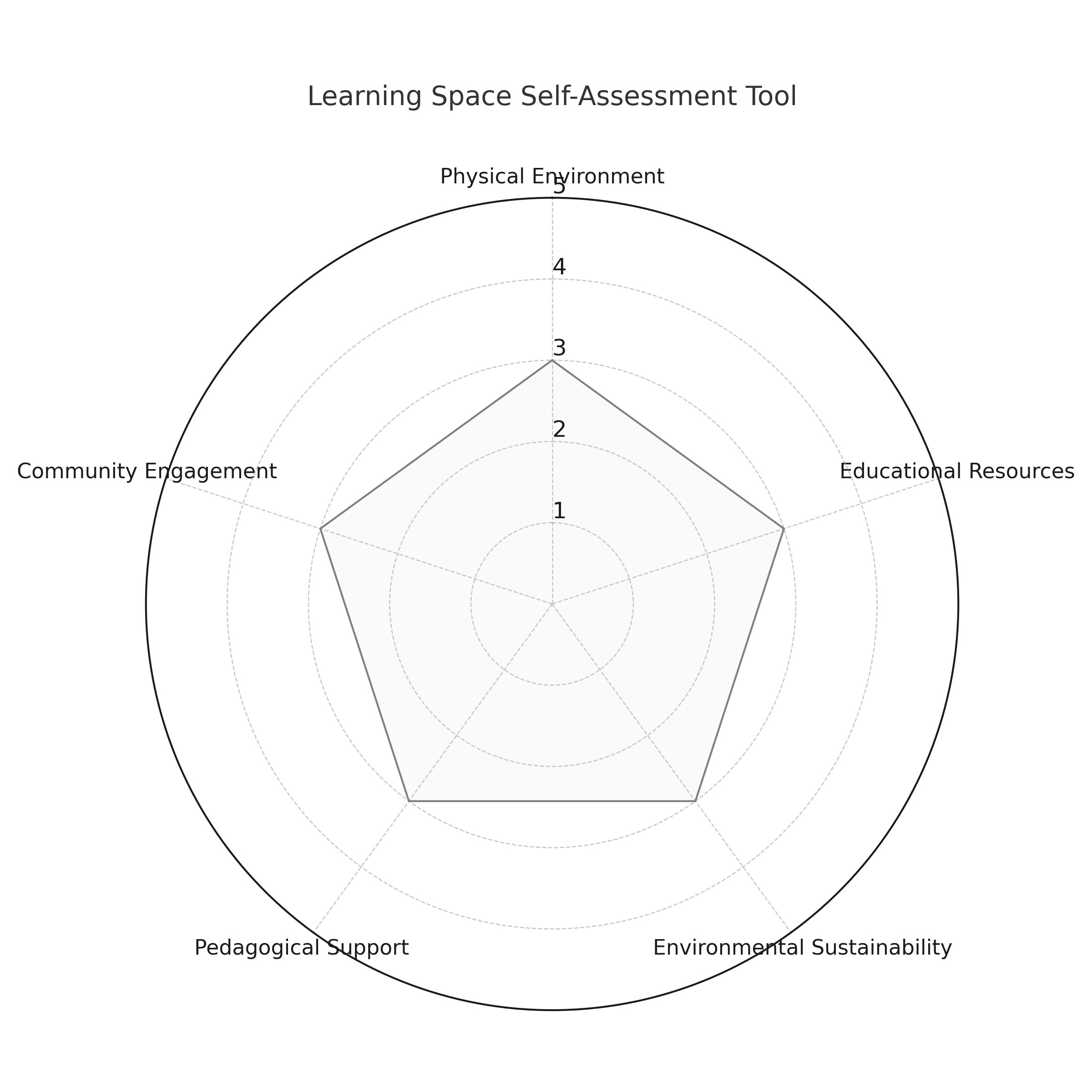
A perfectly round pentagon means a well-balanced space. Most real ones aren't round at all, they're lopsided, pulled in toward whichever dimension got neglected. A beautifully designed studio might collapse inward on sustainability. A space that's spotless on accessibility might score low on community use because no one outside the institution ever sets foot in it. The shape doesn't flatter anyone; it just shows where the imbalance sits, which is exactly the point. A single number can be argued with. A lopsided pentagon is harder to ignore.
The Five Dimensions
The axes were chosen to cover what tends to get left out of conversations about "good" classrooms, not just comfort or equipment, but sustainability and openness to the wider community as well.
Physical Environment
Does the space feel safe, open, and adaptable? Is it accessible to people with diverse needs?
- Score 1–2: Cluttered, poorly maintained, hard to access, or uninspiring
- Score 3: Functional but not adaptable; some limitations in layout or comfort
- Score 4–5: Welcoming, flexible, well-lit, inclusive in design and accessibility
Educational Resources
Does the space provide appropriate materials and tools for its learning goals?
- Score 1–2: Lacks essential tools; outdated or minimal resources
- Score 3: Basic supplies available, but not tailored to creative learning
- Score 4–5: Well-equipped with current, diverse, and flexible learning materials
Environmental Sustainability
How does the space reflect care for the planet?
- Score 1–2: No visible efforts; high energy waste; disposable materials
- Score 3: Some recycling or sustainable practices, but inconsistently applied
- Score 4–5: Designed or adapted with sustainability in mind — natural light, reused materials, low energy use
Pedagogical Support
Can the space support diverse learning activities and methods?
- Score 1–2: Rigid layout, fixed furniture, little room for group work or creativity
- Score 3: Some flexibility, but not fully adaptable to different styles
- Score 4–5: Movable elements, zones for collaboration and reflection, tech that enhances rather than distracts
Community Engagement
Is the space shared, accessible, and connected to the local community?
- Score 1–2: Closed-off, exclusive, or disconnected from outside use
- Score 3: Occasional public use or visibility
- Score 4–5: Open for workshops, exhibitions, and interaction with local residents or organisations
Sustainability and community engagement are the two axes most spaces score lowest on, and not by accident; they're the two nobody's job description usually covers. A facilities manager optimizes for maintenance, a teacher for pedagogy. Nobody owns "is this room actually part of the neighborhood," which is exactly why it needs its own line on the chart.
How to Use It
- 1. Print the radar chart or project it digitally.
- 2. Read the guiding questions for each dimension.
- 3. Score your space from 1 to 5 along each axis.
- 4. Connect the dots. What does the shape tell you?
It isn't built to judge a space, or the people running it. It's built to start a conversation that's otherwise easy to avoid: someone points at the flattest side of the pentagon, and that becomes the thing the team actually talks about at the next meeting.
As learning keeps spilling out of classrooms and into gardens, hallways, and shared civic spaces, the tools we use to think about those spaces need to keep pace. A five-axis chart won't redesign a room on its own. But it gives people a shared, visual starting point, something to point at together, instead of arguing past each other about a feeling nobody can quite name.
This work is part of the Futures Designed project, co-funded by the European Union under the Creative Europe programme, supporting the development of sustainability-focused learning tools and strategies for Art & Design higher education across Europe.
If you're working on something similar, get in touch, especially if you've ever walked into a classroom and felt something was off but couldn't say what.